Friday, October 30, 2015

SIXTUS IV and his beautiful women


SIXTUS IV and his beautiful women


One of the least noticed major Renaissance monuments is the tomb made for Pope Sixtus IV
between 1484 and 1493 by Antonio Pollaiuolo in bronze. It was not commissioned by Sixtus
as it was sculpted after his death, but instead, was commissioned by that other famous Renaissance
patron of the arts, Cardinal Giuliano della Rovere, long before he became Pope Julius II in 1503.
Photographs of this tomb do not do it justice because it is enormous and was meant to be a gigantic
bronze poem in praise of Sixtus. Because of its location in the Treasury of the Vatican in the Basilica
of St. Peter's, it is not often visited and photographs of it are forbidden. Consequently, reliance upon
web-based photos makes for an unhappy conversion of its importance. Nonetheless, it is such a grand
affair, it deserves to be cited along with Michelangelo's David and Botticelli's Primavera as a great masterpiece from the period.       
It is conceived as a bronze table held up by sloping slabs of bronze tablets, on which are represented female figures. At the top of the table, the bronze effigy of Sixtus IV (Francesco della Rovere, Julius II's uncle) reposes with his head wearing a papal tiara lying on two pillows.


 He holds his hands clasped on his chest, and his feet splay naturally as if he were asleep. His eyes are closed, but his profile is instantly recognizable as that of the man in the fresco by Melozzo da Forli or the man in the papal medal:


In the fresco Sixtus is seated on the right and the first man facing him in red is Giuliano della Rovere, the man who ordered his tomb.
Unlike the painting, though, where Sixtus is surrounded by his nephews, male figures, the bronze
tomb has Sixtus surrounded by female figures cast in bronze relief. 
           Sixtus was buried in this tomb, but during the 1527 Sack of Rome, his remains were disturbed
by the marauding Spanish troops, and the remains are now buried, along with those of Julius II, in a small floor tomb in front of the Tomb of Clement X at the back of St. Peter's (past the altar and to the right of Bernini's Cathedra Petri). The bronze monument has been restored recently, but seems to have suffered little major damage in the 1527 incident.
Let us examine the tomb and the rest of the figures.
WHO ARE THE WOMEN around SIXTUS and how many are there? 17 altogether.
THEY ARE ALL IDEAS, expressed in feminine nouns, so the bodily forms of those ideas are
naked or nearly naked female figures because the words are feminine in Italian and Latin. 
THREE THEOLOGICAL VIRTUES:  FAITH, HOPE, and CHARITY
FAITH holds a cross and looks up towards the pope in the panel on the left (from the viewer's perspective); in the panel to the right of his left shoulder, the figure of HOPE lifts her hands in prayer as she turns to gaze at the pope's head as well. The figure of CHARITY is a nursing mother who is placed behind the pope's head (not viewable in this photo.)
FOUR SENECAN VIRTUES:
In the panels to the left and right of the pope's body are two female figures each:
on the LEFT:  
                                      PRUDENCE                                 TEMPERANCE

                                      FORTITUDE                                 JUSTICE
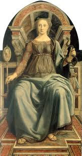
PRUDENCE is similar to the painted version of hers done by Pollaiuolo in the 1470's:
She holds a mirror and a snake; the mirror is for self-knowledge, characteristic of the prudent, and the snake is the symbol of "astutia serpentis" or "prudentes serpentis," the astuteness of the snake referred to in Matthew and later in Augustine and Gregory.
Fortitude holds a club for physical strength. Temperance pours liquid from a pitcher in just the right way to fill up the bowl on her lap. Justice has a sword and scales.
SIXTUS, then, is meant to be associated with the virtues displayed nearest him and on the table next to him.
WHAT OF THE WOMEN in the panels set out in the lower tier below him?
THESE WOMEN REPRESENT the LIBERAL ARTS, the realms of knowledge considered most
important to an educated Renaissance man:
Next to his head at the top of the tomb are two LIBERAL ARTS,
PHILOSOPHIA on the right and THEOLOGIA on the left:
Philosophy looks down and inward, while Theology looks up to the 3-person sun as well as to the head of the Pope.
Near the feet of the Pope are two other components of thought:
RHETORIC and LOGIC: RHETORIC holds a branch from which spring many branches with oak leaves.The oak leaf is the symbol of the Della Rovere family (Rovere is oak tree in Italian); "of the oak" is their name. Not only is the female figure meant to give us a glimpse of the beauty of ornate language, but the branch suggests that Pope Sixtus himself was an orator of some power and persuasion. I have no full photograph for Logic. Rhetoric's legs and feet extend out of the panel into the viewer's space to draw in the spectator to the space she occupies and to be seduced into admiring her beauty.

But the most elegant and sophisticated images of females are laid out on the two sides of Pope 
Sixtus' bier if viewed from the bottom near his feet:
ON THE LEFT SIDE:                                   ON THE RIGHT SIDE:

 ARITHMETIC                                             GEOMETRY
 ASTROLOGY                                              MUSIC
 GRAMMAR                                                 PERSPECTIVE

 
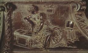
 ARITHMETIC (ARITHMETICA) seems to be working figures on a slate.

ASTROLOGY (ASTROLOGIA) in the middle panel holds a globe in her hands and looks up at the bands representing the sky. 
GRAMMAR (GRAMMATICA) holds out a book for teaching while a younger figure balances a book on her leg:
The right side figures begin with GEOMETRY (GEOMETRIA) on the far right:

 She holds a compass whose two pointers straddle a circle.
MUSIC (MUSICA) plays a portable organ while a putto plays a harp. The diagonal of the bench on which the organ rests suggests the deep space in which the figure sits. Pollaiuolo has
reduced the number of figures he works with in the bronze to one or two and is thereby able to give a greater sense of monumentality to the story of each liberal art. If you compare his bronze reliefs with those of his predecessor in bronze casting, Lorenzo Ghiberti, his elimination of the crowd problems encountered by Ghiberti is clear.
PERSPECTIVE (PROSPECTIVA) bears a round object which may be a type of surveyor's level and an oak branch. The level may refer to the balance given by a sense of perspective. The oak branch is the symbol of Sixtus' family name. (See Rhetoric above.)

Pollaiuolo has encircled Pope Sixtus IV with semi-clad women of grace and loveliness. They are meant to represent ideas, but their mere physicality suggests that they are truly something other than
cerebral. They are embodiments of the enticements of learning, as well as representatives of attraction itself.

        What is most remarkable about the entire project is that Pollaiuolo and Julius II (as he was later known) realized that one of the major achievements of SIXTUS IV was his founding of the VATICAN LIBRARY in the 1470's. The Liberal Arts and the Virtues on Sixtus' tomb are the parts of a well-rounded knowledge which could be gleaned from reading.
        Pollaiuolo has intentionally shaped the bier itself to look like the opening cover of an expensive manuscript from that VATICAN LIBRARY.
The artist even places his signature on the top of the bier as if to take credit for the book itself as the author of it. All that are missing are the hinges on the left and the lock on the right to make it look more like a bejewelled library book worthy of the Vatican collections, like this one:  (Codex Aureus)
Sixtus' book cover places him at center, too, with relief figures in panels to either side.
Giuliano della Rovere (later Pope Julius II) wanted Sixtus' tomb to reflect Sixtus' and Giuliano's achievements and interests. He envisioned and had Pollaiuolo carry out a tomb that is a book, a book to be read and treasured in remembering Sixtus' erudition and wisdom. If the viewer gets to look at naked ladies while admiring, all the better. For Julius understood better than most people the seduction of beauty in the acquisition of learning.


Wednesday, October 7, 2015

Problem of the Corner in Renaissance Architecture

from PALAZZO MEDICI to PALAZZO della CANCELLERIA


When architects begin to create private palaces in the Quattrocento,
they follow the ideas for interior courtyards that were present in Ancient
Roman houses. The interior spaces were designed as squares open to
the sky (the Ancient Roman atria) and in many cases they were framed
on each side by open arcades with rounded arches.
1st EXAMPLE :  Michelozzo's MEDICI PALACE, 1445
While the Palace in Florence built for Cosimo the Elder and his family
on Via Larga (Via Cavour) looked like a fortress on the outside,
with large rusticated stones on the first floor and stonework exterior with projecting roof console on the top floors, the interior of the building, also designed by Michelozzo, gives a less fortified sense to the Medici residence:
He opened the courtyard to the sky to let in light and he set in place Corinthian colonnettes supporting
rounded arches with airy windows above the center of each arch. To make the courtyard look larger than it was, he extended the length of the arcade at the back, as we can see in the plan for the building:
If one entered at the bottom of the drawing, the space from wall to column at the
entrance is smaller than the space from column to wall at the back of the courtyard.
The enlarged space would have made the palace itself look more imposing on the inside, but while he gave that optical illusion to the viewer,  he inserted another which became problematic for future builders.
MICHELOZZO's CORNERS:
The corners of the Medici Palace courtyard appear to melt into the fabric of the
building. Michelozzo places two round arches next to each other at the corner and he shows us two windows above supported by those arches. The arches themselves, however, come to a point at the corner resting on one column only. The consequence of this decision is that, to many architects, Michelozzo's corners look weak, as though they could never support the two arches, let alone the windows above them. The viewer has an uneasy feeling when looking at the corners, as though they might collapse under the weight of the building. It is possible for the viewer to see the arches as continuing in a straight line rather than turning to the side aisle. The articulation of the space suffers in the optical illusion because it becomes harder to "read" the structure and shape of the space.
2nd EXAMPLE:  URBINO, PALAZZO DUCALE (by Francesco di Giorgio Martini as well as by Laurana) The exterior of the ducal palace made for Duke Federico da Montefeltro between 1470 and 1478 is less fortified than the Medici house, but it still has turrets with staircases and large pink bricks lifting it up the hill high above the level of the street.
The color of the bricks lightens the imposition of the place and the balcony arcades suggest a piercing of the wall of the castle. As one might expect, the architect follows similar rules to those of Michelozzo in planning the interior courtyard: the inner court is open to the sky, and it is a rounded Corinthian arcade that supports the two stories above it:

But unlike in the Michelozzo example, the space measuring column to wall is even all the way around the building, giving it a sense of solidarity to the eye. And Francesco di Giorgio handles the problem of the corners in a much stronger way than Michelozzo.
He reinforces the corners by several devices:
1) he makes the corner arches come down on or spring from a Corinthian column attached to a pier; this allows him to retain the spandrel roundels, strengthening the impression of the corners with two circles, two engaged (or attached) columns, and two pilasters. (The spandrels are the spaces above the two arches and in between them; here white moldings make a circle, a roundel within the spandrels.)
2) he supports the second story corners with the two pilasters joined at the base and he continues the theme of square support by repeating the engaged pilasters between windows in the second story.
3) he articulates the space of the corner as different from the rest of the arcade, therefore allowing the viewer to "read" the building as having sustaining parts that are strong enough to hold up the rest.
The "reading" also includes understanding exactly where the building turns the corner to form a square.
4) the Latin inscription which runs the length of the building in the architrave on both stories, praising the Duke of Urbino, has pauses or stops at the corners, which contribute to their literally being "read"as forceful elements for one side or another.
Martini's solution for the problem of the corner is to make it stronger by doubling up the elements. Some architects might object to this as being "heavy-handed" and say that it makes the courtyard too bulky, but the lightness of the stones (pink and white) tends to counter that heaviness and make his solution a viable one.
He creates another problem to be solved, however, in the process. His corner doubling forces the capitals of the pilasters on the first story to occupy the same space as the spandrel roundels. The uneasiness of this coexistence is visible in closeup views:

The spandrel roundels look like (parentheses) next to the pilaster capitals. The overlapping does not quite work and makes the viewer question the accurate measuring of the rest of the arcades.
3rd EXAMPLE:  ROME, PALAZZO DELLA CANCELLERIA (again by Francesco di Giorgio Martini? or Laurana, 1483-1517).
This later Roman example differs from its predecessors in two ways we might expect because of its location in Rome: it is LARGER, perhaps responding to the monumental quality of buildings in Rome, and the palazzo includes a church within its premises, the church of San Lorenzo in Damaso, since the palace was built for a Cardinal of the Church, Raffaelle Riario; Rome as the center of the Catholic Church may have some effect on the desire of the patron to build his home around an already-existing church, and his own job as cardinal of that church contributes to his desire to work not far from home.
The exterior is still a fortress with jutting tower battlements, but the interior courtyard is much as we might expect for a ducal residence.

How light and airy it is, and not just because of the color of the stone. Martini has decided that instead of windows on the second story, that he will continue the arcade theme from the first floor onto the second, opening up the space and creating walkways above and below on all four sides of the building's interior. He does not repeat the exact heights of columns and arches on both floors.  He tailors the second story by making the lengths of the columns 2/3 of the length of the columns on the ground floor, and he reduces the height of the arches to 2/3's the height of the arches on the ground floor. That proportional system, also present in the contemporary building of Santa Maria delle Carceri in Prato by Giuliano da Sangallo (church 1483-86), is a mathematical realization of measurements that are easy for the eye to comprehend and make for an aesthetic transition from first floor to second:

In the case of our Roman palazzo, the architect elevates the building even further by leading the eye up from first to second story by means of repeating arches, but then he repeats the columns' positions between arches on the third floor by placing an engaged pilaster in white stone between windows and directly over the same location of the columns on the lower two stories (similar, in fact, to the placement of the pilasters in Urbino.)The effect of these changes is to emphasize the vertical thrust of the building and make the building soar with light. It is a more welcoming courtyard than either of the previous two we have seen, a pleasant place to come home to for the patron.
          Martini's solution to the Problem of the Corner is, too, revealing. Instead of repeating elements as he did in the Urbino corners, doubling up the columns and pilasters and spandrel roundels, he decides to give the corners strength and articulation by making them one reinforced pier that supports the two arches coming together there.  These piers "read" as though the punctuation at the end of a sentence and are satisfying to the eye because, though they use some of the same stone (pink and white) that we see in the rest of the building, they are not round and so are not confused with the arcades themselves; they produce "endings" after the series of rounded arch elements and soft rounded columns on which those arches rest. He also eliminates the problems of doubling roundel and pilaster capital which occurred in Urbino by simplifying the arches' arrival at the pier and removing decoration in the spandrels down to the banding around the pier itself.


Within the spandrels he sets the cardinal coat-of-arms of his patron, stamping the building as the owner's and also referring to the occupation of his patron as the chancellor of the Vatican. These roundels with cardinal hat and tassels have not been removed, in part because the building's function is still that of the Vatican Chancellery, the tax accountants for the Pope, hence its name, Palazzo della Cancelleria. The money is not here, but the bookkeepers for the Catholic Church still work in the building.
            The result of Martini's solutions is that the building of the Palazzo della Cancelleria is light-filled, airy, but substantial and grounded, a joyful place to come into and to reside in, and because of the articulated corners, a place the visitor feels safe in and satisfied visually.
             Martini includes only one thing from Michelozzo's earlier work in reverse: he makes the space between wall and column as you enter the courtyard larger than the distance between column and wall at the visual end of the courtyard; perhaps the result is the same, though. The building appears more massive and grand, with the square courtyard open to the sky less likely to disappear into that sky and less likely to be subsumed into the space of the aisles.
             The changes in Renaissance residences within the Quattrocento may seem subtle compared with changes that take place in the Baroque period, but the architects are building on precedent and experiment in certain areas to give their patrons their latest thought about what makes a building embody "la bella figura."